Project Overview
NASA, a United States icon, needs a website to match it's prestige. With this redesign, I looked to capture the wonder of space with the curiosity of its users.
Role & Scope
This redesign was an individual project for my UX/UI certification, so I handled research, ideation, design, testing, and prototyping. The project's scope focused on the brand and home page redesign.
Heuristic Analysis
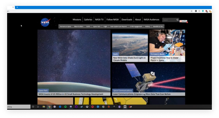
To gain an understanding of the current state of the NASA.gov website, I reviewed the home page using a heuristic analysis.
User Testing
To identify pain points and redesign opportunities, I observed users interact with the current iteration of NASA.gov via screen sharing software. Through this testing, I was able to begin formulating ideas for my re-design.
Comparative Analysis
Although NASA may not have true competitors in a classical sense, I searched for insight and inspiration from other government agencies and space-related entities.
Navigation Analysis
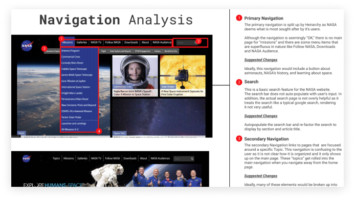
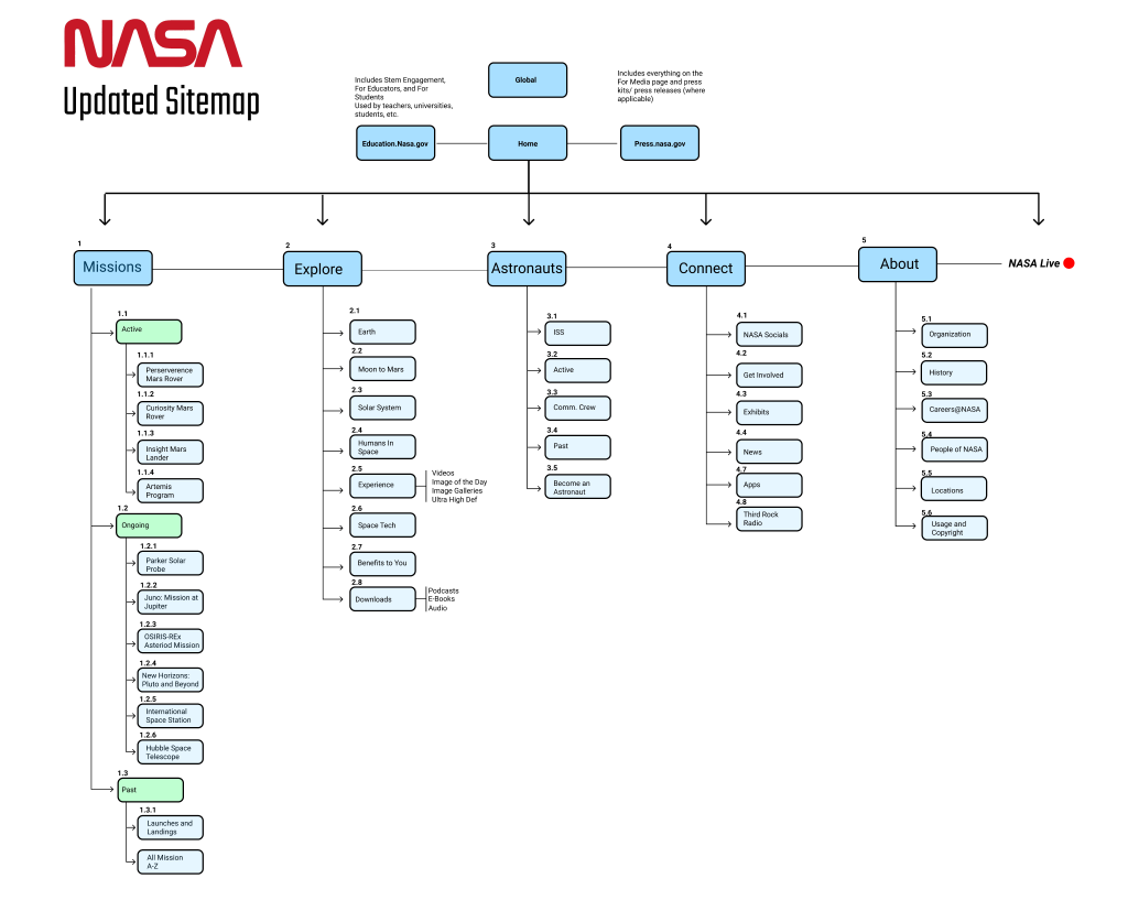
From my user testing, it was clear the current NASA website was filled with useful information -- but it was difficult to navigate and find. I performed a navigation analysis to get to the root of the problem.
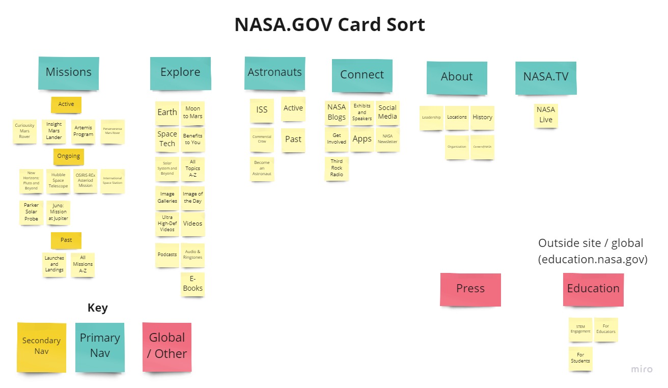
Card Sort & Sitemap
To gain an understanding of the current state of the NASA.gov website, I reviewed the home page using a heuristic analysis.
Feature Prioritization Matrix
Through my research and user persona, I began coming up with ideas for the redesign. and asking the two important questions:
- What was important to the user?
- What was important to NASA?
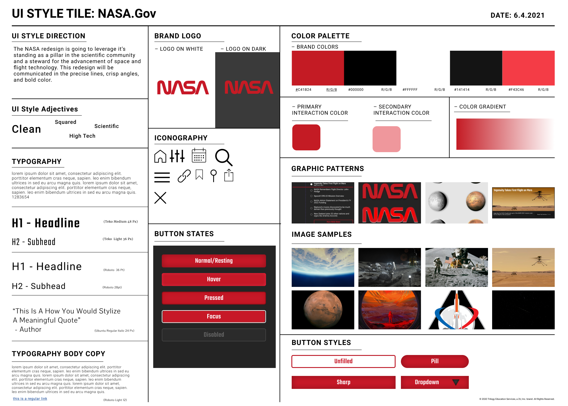
Brand Refresh
The NASA 'Worm' logo, the red and stylish logo introduced in 1975, is making a comeback -- and I felt it was a perfect opportunity to put it to work on the website redesign.
Using the worm logo as a basis, I developed a style tile to help guide my redesign.
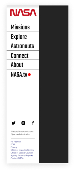
Early version of navigation.
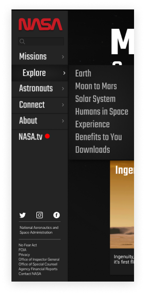
Final version of navigation.
Navigation Wireframe
Due to the immense amount of information and content on the NASA website, the navigation needed to be able to scale for the future while being robust enough to handle the current site-map.
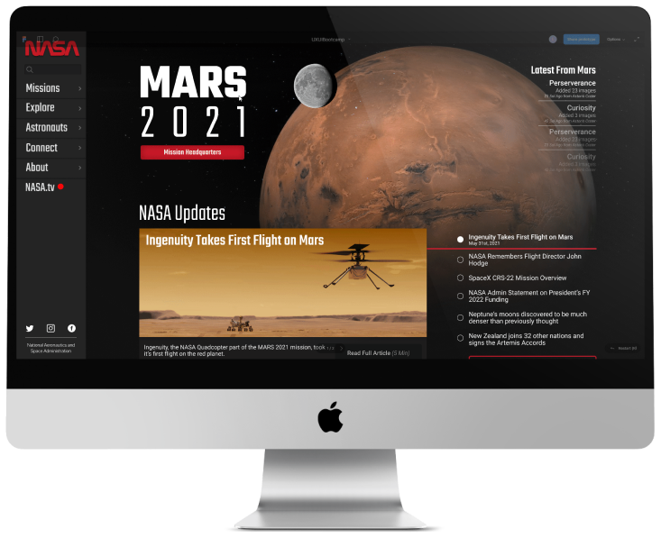
I settled on side navigation, as it was easily-scalable to mobile and accounted for future growth.
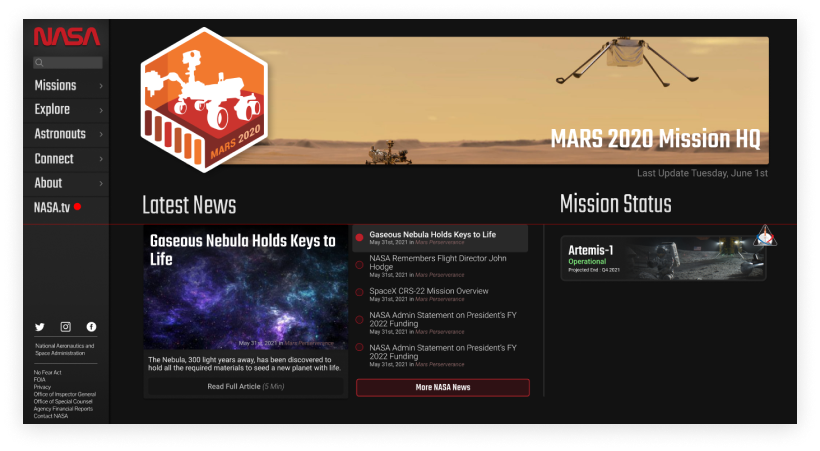
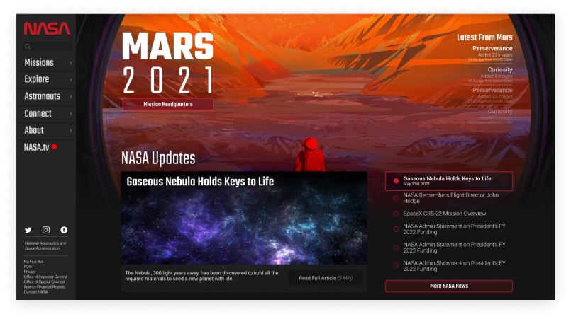
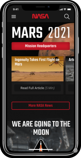
Initial Homepage Prototypes
From my research, users weren't aware of NASA's active missions. I wanted the homepage to give the users the information they wanted.
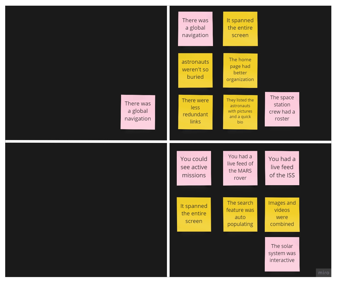
User Testing
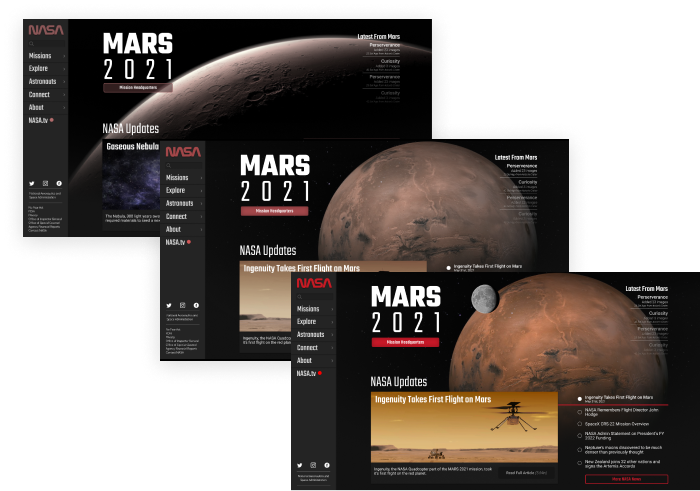
After an initial round of design, I began user testing the redesign. The tests were short, but I encouraged users to speak their mind.
In observing the tests, it was clear the design needed a slight course-correction back to space.
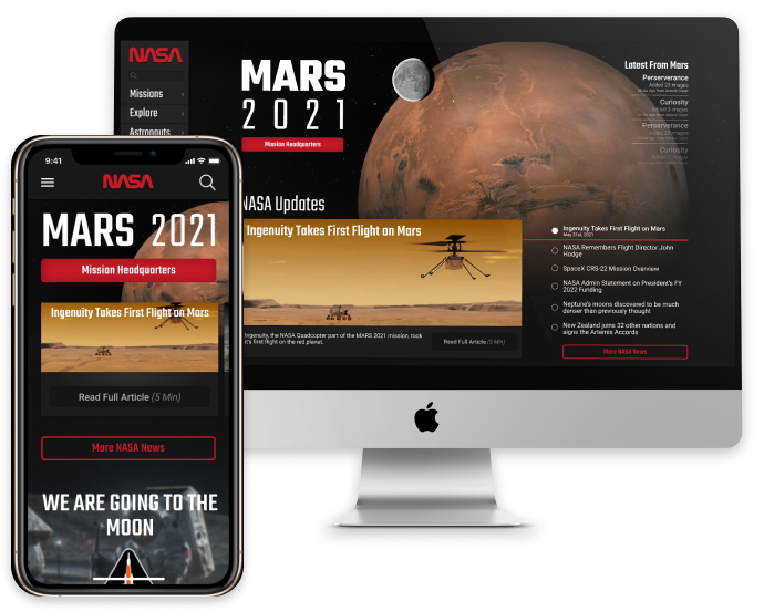
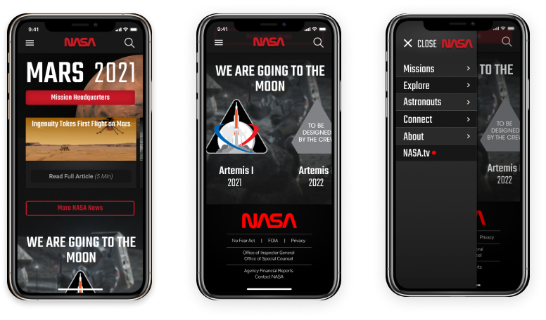
Responsive Prototypes
Always designing with mobile in mind, the components and navigation were easily transferable to a mobile layout.